Nature Squared
The Brief
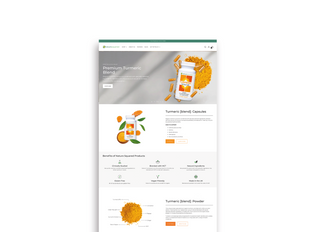
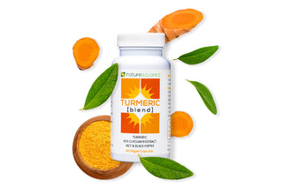
Nature Squared sell a range of health supplements to boost your wellbeing. All sourced from the purest natural ingredients, their products have endless positive reviews and they have an extremely loyal customer base.
Nature Squared needed to convey the same energy, passion and enthusiasm that is displayed each and every time you visit them at one of their exhibition stands to their website. In addition, the website user journey needed improving. Our job was simple; to improve the user experience so that it’s easy for customers to buy and again and to showcase the benefits of their products so that they can attract new customers and increase their conversion rate.


Our Process
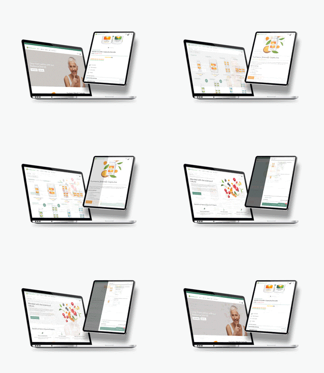
We started by re-thinking the user experience so that it was easy for new customers to understand the products and to easily identify the benefits of each product. We created a well-thought out navigation and optimised the homepage to create a clear understanding of the products and their benefits.
The design on their website was out-dated and didn't showcase the benefits of each product so we refreshed the look and feel of the website. additionally we designed icons to showcase the features and benefits of each products.
Our Solution
The result of our work was a fresh and clean website that beautifully demonstrated the work and effort Nature Squared put into their business. With our minimalistic approach, we were able to bring their brand to life and modernise the design to make Nature Squared stand-out from their competitors and appeal to new customers.

